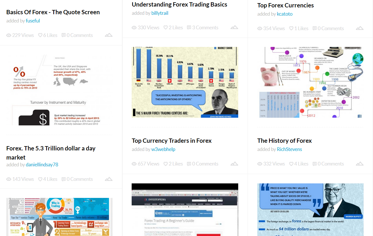
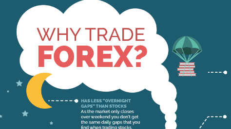
This post was originally written in 2015 when I was working on a world-known Forex broker. Time passed, but it’s still a great resource for marketers working in the Forex niche. This well-researched article has lots of practical examples, so you can explore the topic deeply and learn from others’ experience all in one place. Enjoy reading!
Infographics, along with video, interactive tools, contests and games, are powerful tools for reaching the mind of a modern Internet user, who prefers not to read but to scan.
What does it mean to make an awesome, cool, successful infographic?
The answer depends on the goal you set in each particular case.
Sometimes you just need to make your content well framed for better perception and understanding. This is a great way for you to impress clients and partners with a nice infographic describing the achievements of your company in graphics instead of long, boring text.
Sometimes it’s almost necessary to draw, when the subject or concept is so complex that it can only be explained with pictures.
The most dignified goal you can set when planning an infographic is to make your content go viral, seen and shared by as many people as possible.
What will you get when infographics go viral?
- Brand Awareness
When your content goes viral, the audience you interact with goes beyond the scope of clients and partners who visit your website or see your company news in their Facebook feed. You will get extra attention from people who have never heard about your product or services, from those who know you but do not associate you with something they need, and from those who have a stereotyped opinion of your company. If you try to draw their attention with something creative, you will get a valuable positive association with your brand. You can make them think of you as an expert, an innovator, or just a cool company.
- Link Assets
When a piece of content becomes popular, its author and source are usually quoted. In other words, you’ll get an extra brand citation and links to your domain that can help your SEM (Search Engine Marketing). I have several cases with valuable wiki links to show you.
Case #1
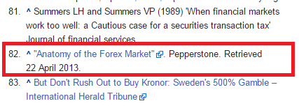
One of my favorite examples: The Anatomy of the s linkingPepperstoneForex Market by Pepperstone. The strongest wiki page about the Forex industry links to the company’s website. Awesome work.
Case #2
Mean Reversion Infographic from ForexUseful.com
Case #3
U.S. Trade Deficit Depicted in an Infographic from Capcredit.
Forex infographics: what to consider
- The Forex niche is quite narrow
Promoting infographics about relationships, food, cars, or anything everybody has in life is much easier. The chance to resonate with a wide audience on the basis of things they know and understand is quite high. Infographics about money or financial literacy may go well too, but Forex trading is not one of those things that everyone knows about or has experience with. Therefore, the number of likes, shares and quotes will be lower, and that’s natural.
- Forex is complicated
The industry operates with a number of complex terms and concepts, so it’s not so easy for those who have no experience in trading to understand them. Your infographics seem witty to traders, but they say nothing to average people. You shouldn’t count on the success you may achieve with a more universal product. At the same time, you may still get a response from those familiar with the subject, and that’s valuable. You also have an option to create something FX-related but still appealing to a wider audience (like MahiFX did, which I’ll show you later).
- The level of FX knowledge and experience may vary
An FX trader goes through several stages in his professional growth and development, from extra-income seeker and FX-bonuses hunter to hot-head enthusiast and high-volume PAMM manager. You should keep in mind which type of trader may need the content you produce and may find it interesting.
Case #1
The infographics by Oanda: http://fxtrade.oanda.com/analysis/infographics/
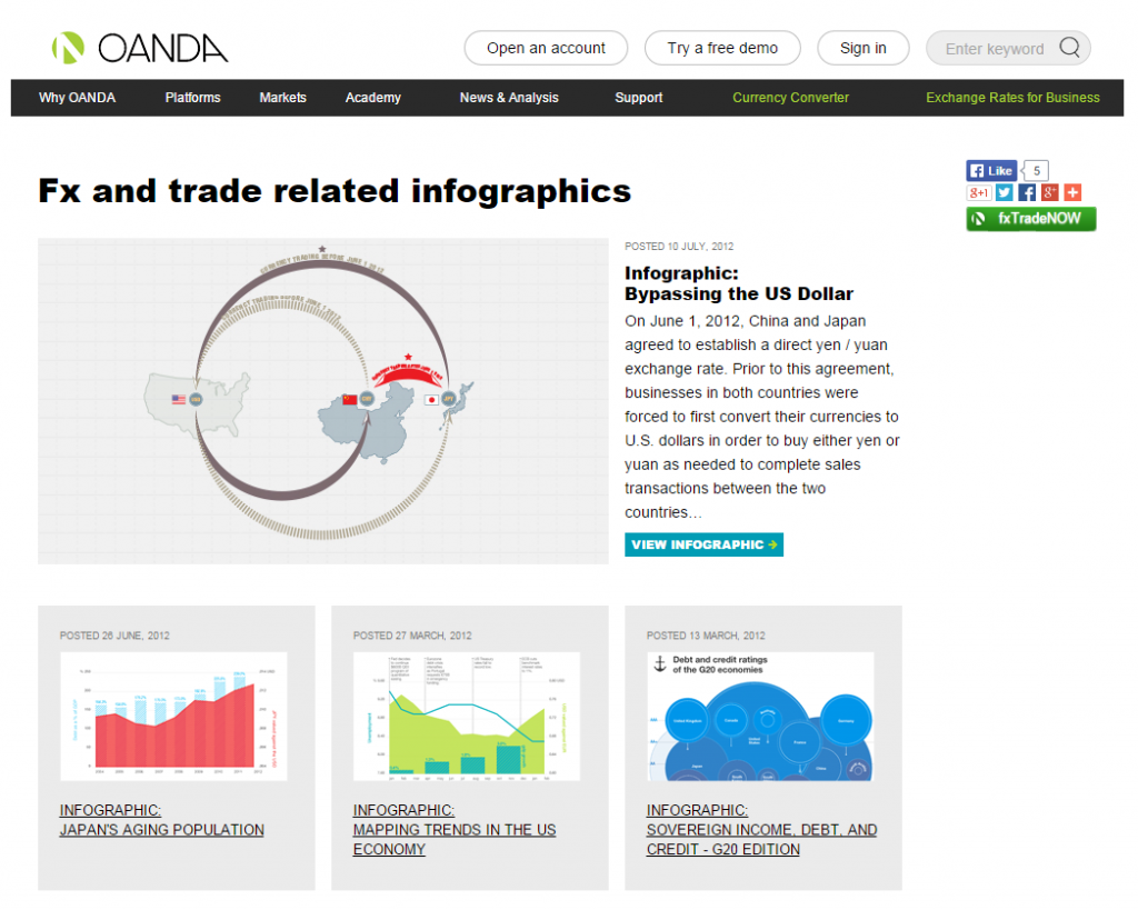
Oanda promotes professionally designed, data-driven, experts-oriented content.
Case #2
If you hunt for beginners, there’s a chance to be creative enough to find a common ground with users who have no experience in Forex and focus on those people interested in extra income and self-employment.
MahiFX: You Vs. John Paulson
Forex Infographic Common Patterns
- It explains something about the company and its products and services, helps you visualize the process, and makes it easy for you to understand what you may get from cooperation.
How do people make money social trading by Vantage FX
- It explains complex Forex terms and concepts.
Forex VPS by EarnForex
Types of Forex Orders by PaxForex
- It gives trading advice.
Storm Warning in Effect by Oanda
How to create a successful Forex strategy by PaxForex
- It gives a broad vision (useful or entertaining data): historical overview, market related analysis, stats, research, or insights.
A great FX infographic will attempt to reach each trader’s mind and form a positive image of your company as an expert.
The growth of mobile in online trading by FXCM
Algorithmic trading in the FX market by Interbank FX
Rise of the Female Trader by CityIndex
- It presents motivating, entertaining, so called wow-infographics.
This will reach a wide audience of non-traders, which is not easy. But I know of a great example, which means that it’s possible.
You vs John Paulson by MahiFX
There’s no doubt that this sample is the most quoted FX infographic (#1, #2, #3) that successfully managed to go viral.
Why is form important?
Because a creative form of data visualization is the only way to be imprinted into the viewer’s memory and get noticed.
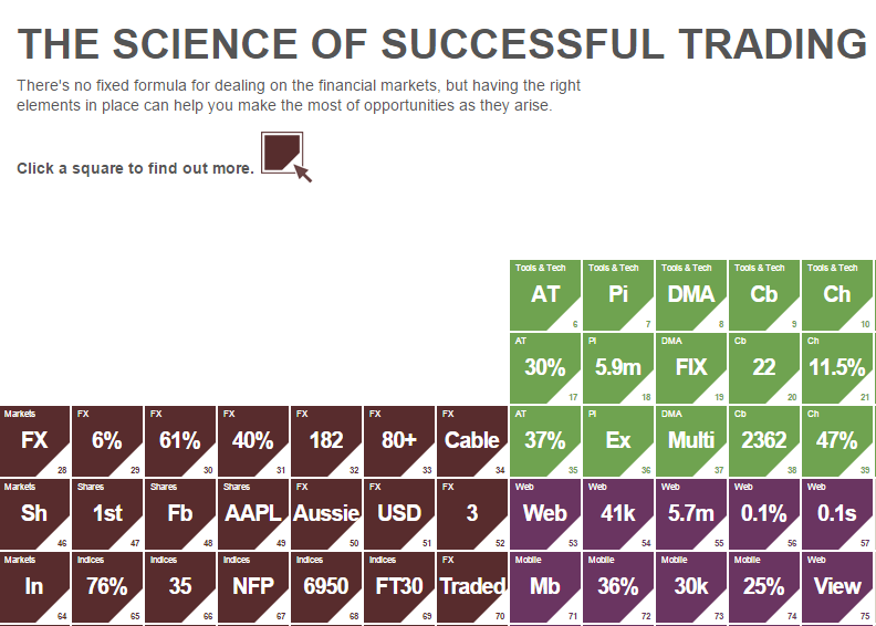
IG surprises us with a new interpretation of the periodic table: Periodic Table of Trading.
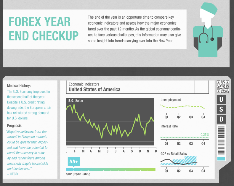
Oanda tries to check the market as a doctor: Forex Year End Checkup.
Common mistakes:
- Too much branding
Forex Year in Review 2013 – the logo is the same size as the title and looks a bit annoying.
- Self-concentrated (too promotional)
Examples: RVD Markets promo infographics, FXOpen Developments in 2013, ForexCamping.
- Too much text, hard to perceive
Examples: Too much text 1, too much text 2.
- Junkyard of colors, awful design
Examples: Fire the designer 1, Fire the designer 2.
- Little data
Vantage FX explains FX terms, and pretends to “Mr. Plainness” title: case #1, case #2.
- What FX is and how it works
It was a great idea in the early infographics era, but it’s a bit of a hackneyed topic at the moment if you explain it without some extra-creative vision.
Conclusion
It’s a great idea to use visualization for better understanding. But if your goal is to make a great piece of content that others will share, something with potential to go viral and earn you backlinks and traffic, try to impress, entertain and make a difference.
When working on FX infographics, think of your audience. When you target traders, give them a comprehensive outlook on a topic and share the knowledge neatly or attract them with expert vision and trading insights. When you target a non-FX audience, just try to impress them with what is possible to achieve in Forex so that they perceive you as an expert and want to try it.
Who are the remarkable leaders?
According to Visual.ly, the leading infographics aggregator, there are two pieces picked by their staff as great examples for the keyword “forex”.
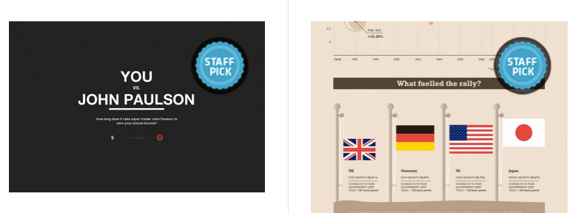
They are the “You vs John Paulson” masterpiece by MahiFX and “Is the Recent FTSE 100 Bull Run Now Over?” by Saxo Bank.
The dessert
Techniques that will definitely increase your chances of success:
- Jump out on time.
Is there a new change in the market or a topic of current interest? When there’s a lot of buzz on a topic, make use of it.
- Use a captivating title that motivates them to look inside.
“9 Things You Didn’t Know about Successful Forex Traders,” “Why Retail Traders Have High Failure Rates,” and “What Type of Forex Trader Are You?” look much more interesting than “How Does Forex Trading Work?” or “Understanding Forex Trading Basics.”
- Provide substantial content.
You’ve probably heard that content is king, but those who say that phrase often forget to mention what content should compete for the crown: it should be well-researched content that is in high demand and that strikes a chord. An infographic is just another piece of content, so in order to make a great piece, raise an idea, introduce your research, and wrap it perfectly. Then you’re done!
